
Online sports brand Wiggle is inspiring consumers to enjoy getting active with a dynamic new identity developed by Manchester creative agency LOVE.
Already a much-loved retail platform among cycling enthusiasts, Wiggle picked up further momentum when a new wave of fitness fans emerged during lockdown. The brand saw an opportunity to serve a broader multi-sport audience by expanding its offering and celebrating the less serious, more social side of exercise – the joy of getting your Wiggle on, however you do it.
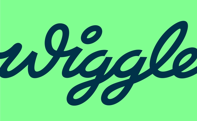
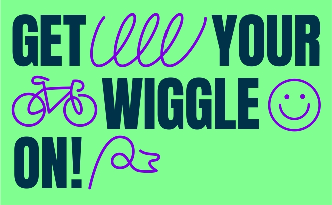
Working closely with Wiggle’s internal brand team and strategic consultancy Eat Big Fish, LOVE gave the brand a fresh positioning and visual identity that was fully fit for purpose. A new brand proposition – “always up for it” – came first, paving the way for a hand-drawn cursive wordmark inspired by kinetic motion, a vibrant colour palette (check out that digitally optimised Aquamarine) and a positive, playful brand voice equipped to motivate athletes of all abilities.
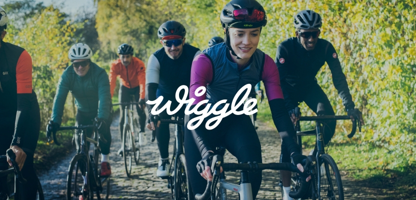
The rollout of new brand assets includes photography produced in collaboration with local running, swimming, and cycling clubs as well as community hiking groups, shot to capture real and relatable exercise moments.
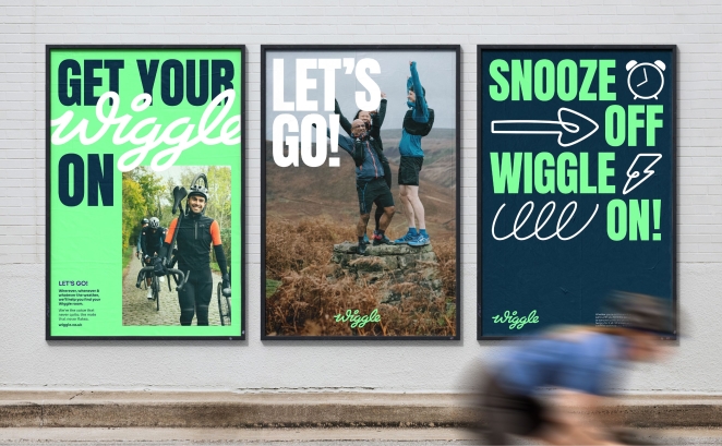
As a primarily online brand, Wiggle needed an identity system that could flex easily across digital platforms. LOVE created a bespoke suite of icons, ranging from an alarm clock and “power banana” to a coffee cup and well-earned slice of cake, to reflect every aspect of the active lifestyle and give Wiggle’s social channels an even greater energy boost.
To learn more, we spoke to Rory Sutherland, Creative Director at LOVE
What was the brief for the rebrand?
The brief was quite simple: put the soul and the fun back into Wiggle.
As an established performer in online sports retail, Wiggle’s identity was starting to age and their specialist sports focus was narrowing their potential target market. Our role was to help them develop a new brand positioning and full identity system, something that would help them find their voice and broaden their appeal with a growing, less ‘do-or-die’ audience.
How did the initial pitch/brainstorming phase go?
The early phases were open workshops between ourselves, Wiggle and Eat Big Fish (Wiggle’s strategy agency). It was here that we really got to know the clients, the Wiggle brand, its history, audience and competitive landscape.
It was also during these early meetings that we started to nail down the brand strategy, ensuring we’re all aligned in our goals and that we create the best possible springboard for the design phases to follow.
Describe the purpose of the brand and its target audience
I guess the best description here is the line that fell out of those early workshops. The brand exists to help you ‘Get Your Wiggle On’. So whatever your sport, your level, your motivation they are there with the gear and the knowledge to get you moving.
It’s this accessible, less performance-orientated language that also starts to shine a light on their broader audience profile. It’s less about the pain and gain, the blood sweat and tears, the PBs and records, and more about celebrating the less serious, more social side of exercise.
The post-Covid fitness boom saw a lot of new people getting moving. We wanted to portray sports and exercise as something you could actually enjoy rather than something to be endured.
What was your thinking behind the rebranding solution?
What’s the first thing that comes to mind when you hear the word ‘Wiggle’? For us, it was movement, fun, play. A cheeky almost mischievous energy… All of which the old logo lacked.
So in a way the thought process was quite simple, even if in reality it took a few rounds to get it right. It was all about putting the wiggle back into Wiggle.
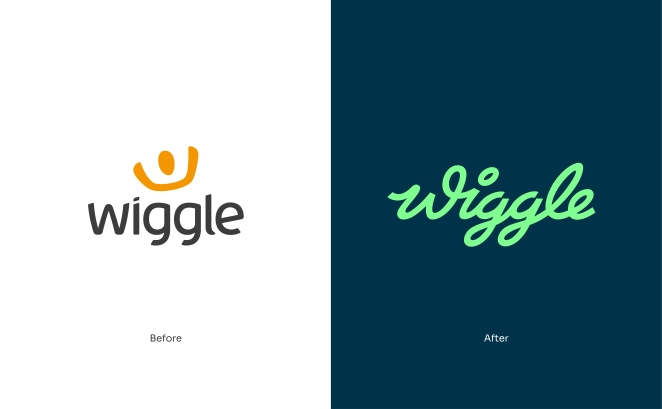
That's why cursive forms add the energy, the play, the Wiggle. A distinctive W with the ligature builds in ownability, whilst the logo’s forward motion means we’re always in a state of movement and progression.
Did you learn anything new during the project?
Apparently if you decide to shoot your brand campaign in the North of England in Autumn, you can cover multiple seasons in one day. Who knew?
What was the biggest challenge? How did you overcome it?
The biggest challenge…Well, let's say there was a big debate about whether to retain or lose the old orange brand colour. In the end, I was glad the client made the call to push into a new space to signal the brand's new look, so that made it easier! Oh and then any situation where you want vibrant onscreen colour to translate in print. That's always a fun one.
What kit/tools/software were used to create it?
Apart from the great team behind it, there’s all the usual kit. The Mac and the Adobe Creative Suite. The backbones of any design studio.
What details are you most proud of and why?
Personally, I think the whole thing came together really well. The strategy phase was fun and gave us licence to really change things up creatively. This, paired with the client's ambition for a big shift, meant that we knew that whatever we did, we’d end up in a exciting new space.
I’d say one of my favourite elements of the broader identity is the logo itself. I think it communicates all of the things we set out in the early stages. It had to feel at home in the world of sport, to be both classic and modern at the same time, and it had to be distinctive. I’m biased but I think it hits the nail on the head.
Oh and a big shout out to Percy Dean - the photographer that captured the initial launch imagery. The photos have a really nice candid real feel, but also capture the warm and social side of sport. The conditions and shoot schedule were tricky to say the least, but we were super happy with the results.
What visual influences fuelled your solution?
A few of the team here at LOVE are real cycling, running and swimming nuts. Their specialist knowledge of the culture, from obscure specialist brands to sporting events and classic race jerseys played a key role in our creative exploration during the design phase.
Colour was also a big focus, for us and the client. We dived into the world of colour theory, looking at how we can build reason and purpose behind our choices.
What do you hope it achieves for the brand?
We hope the new identity helps the brand grow and connect with their audience in a much more effective way than they could before.
We know the brand always had a loyal following amongst a core set of sports enthusiasts, and we know rebrands can be divisive, especially in the early days. We hope they like the new look, and that the energetic personality of the rebrand helps connect with those people who are new to or less serious about sport.
We all know the physical and mental benefits of exercise, so any chance to help influence more people to get moving is a big win for us.
What would you do differently if you could do it over again?
Hmmm. The only thing I would say would probably be to have more in-person meetings between ourselves and the client team. As is often the case with everyone's hectic schedules, Zoom presentations and meetings are often the go-to, but in reality, it’s when you’re all in the room together thrashing things out that you seem to make the biggest strides. It can help speed up the process too.
That’s a minor thing though. It was a fun project with a great team.
Credit list for the work?
LOVE: Senior Account Manager: Vicky Yeend Account Manager: Amy Dunwoody Strategy Director: Neil Bennett Creative Director: Rory Sutherland Senior Designer: George Kirk Senior Designer: Luke Heyes Senior Copywriter: Owain Thomas Creative: Luke Simons Copywriter: Emma Cocker
Commissioned Photographer: Percy Dean
Client Team: Ed Cracknell, Phillip Read, Gareth Logue